Typography
Our chosen typefaces ensure readability across all platforms, while adding a unique, bold character that aligns with our vibrant design community.
Figma Sans Bold
The quick brown fox jumps over a lazy dog.
The quick brown fox jumps over a lazy dog.
Figma Sans Regular
The quick brown fox jumps over a lazy dog.
The quick brown fox jumps over a lazy dog.

Color Scheme
Each hue is thoughtfully chosen to create a cohesive, welcoming brand that resonates with our creative community.
Chapter Colours
Core Colours

Logo Guide
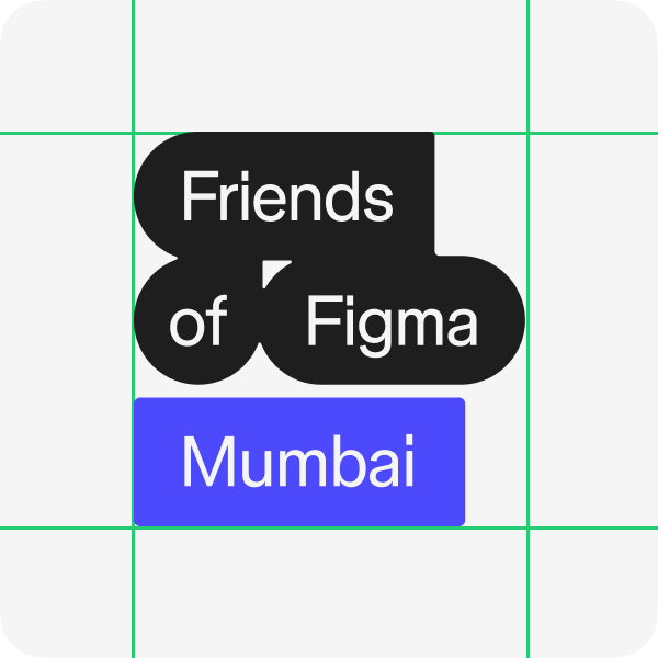
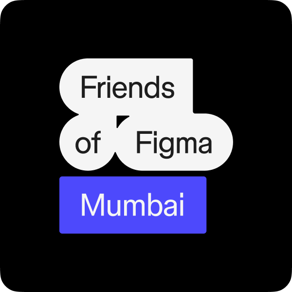
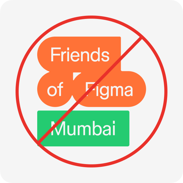
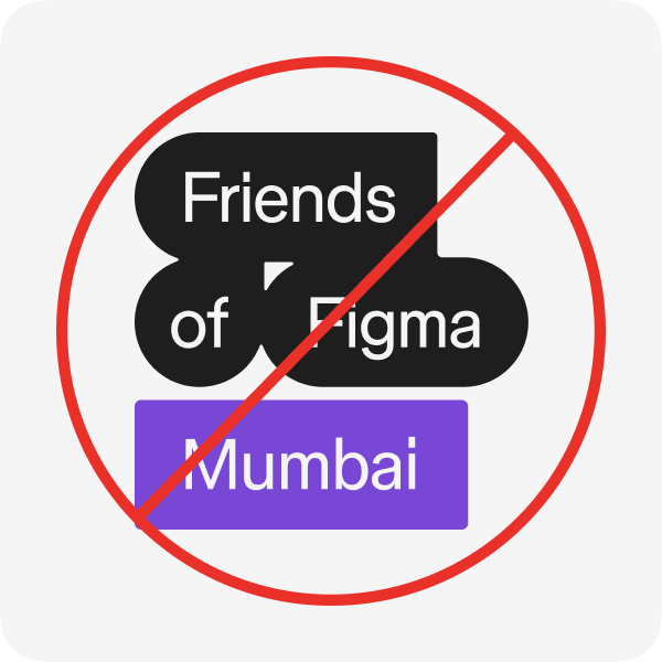
Consistent use of the logo helps build brand recognition and unity, so please follow the guidelines for color, spacing, and scaling to keep our brand strong and impactful.
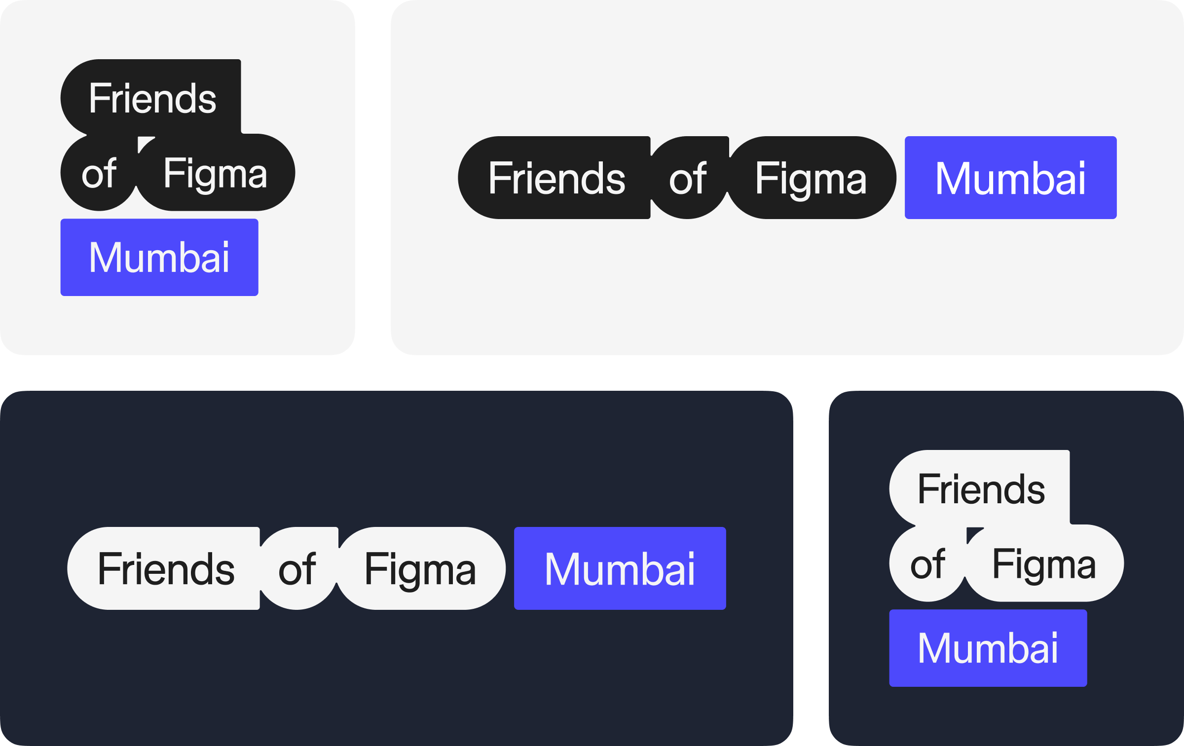
Primary Logo
The logo combines the logotype with the chapter name, with variations provided for both the stacked and lined arrangements.
Partner Logo Strip
The partner logo strip should be used when the chapter is one of multiple sponsors.

When including the chapter logo in a partnership strip, aim for the cap heights to be roughly aligned.

Dos and Don'ts